96 Degrees
Brand creation
Brand identity
Brand positioning
Naming
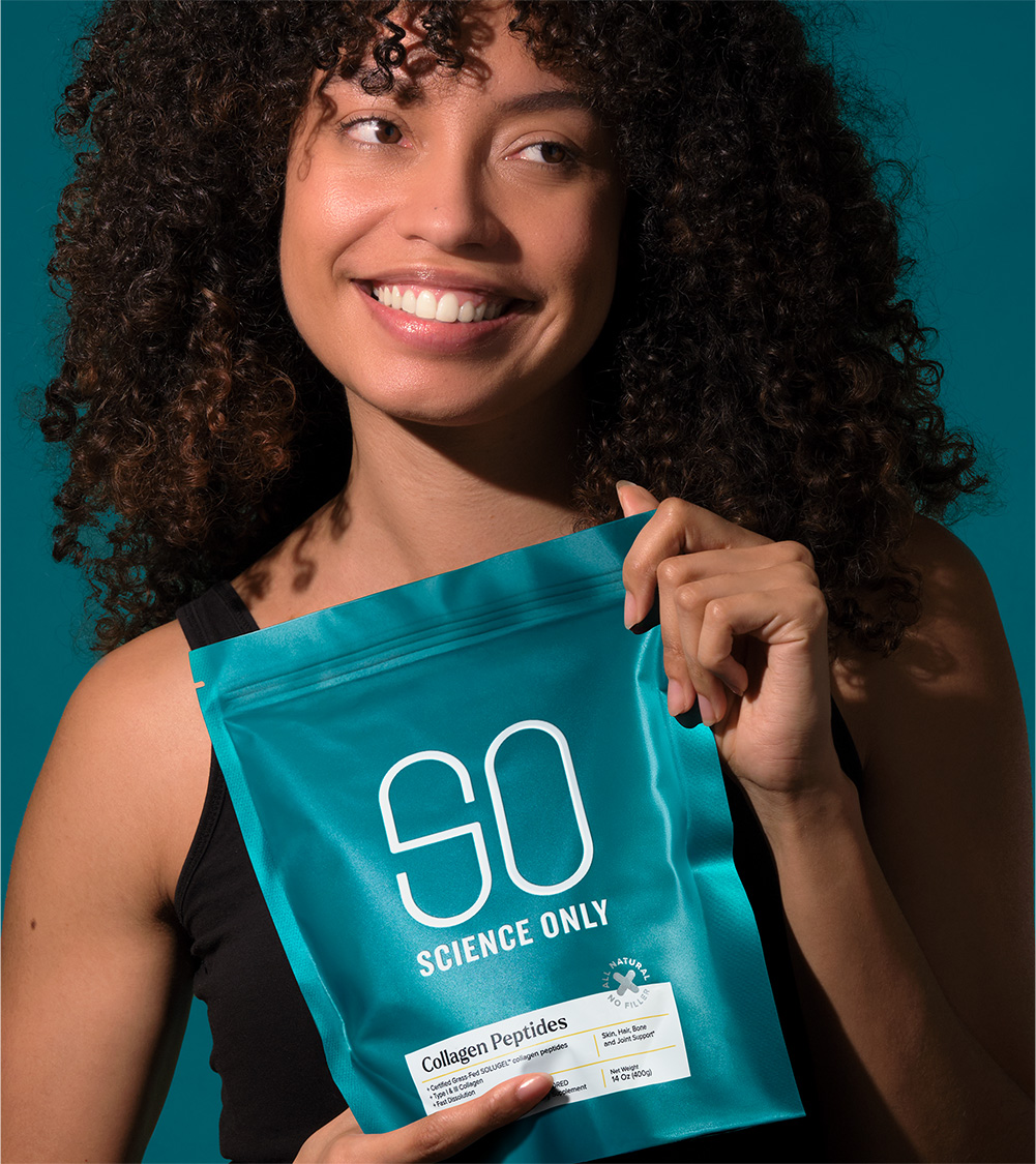
Packaging
Pursuing perfection.
No-one knows more about tea than the 96 Degrees team. From a family who spent decades in the tea business, the diminished standards of today’s tea market weren’t living up to expectations. On a mission to share their love of tea and make high quality available for all, they took matters into their own hands.
Passionate about perfection, they pursue the best growing conditions, source the finest ingredients and ensure the freshest flavour preservation.
Inspired by their unstoppable obsession for detail, we created a name that captures the ideal brewing temperature, from which bespoke illustrations unfurl; releasing the unique flavours and abundant characteristics of each beautiful tea experience. Perfection indeed.
Straight from launch in 2024, they secured listings in Coles and other major Australian retailers. Coming to the UK and other markets soon. Best get the kettle on…